Snaps by em
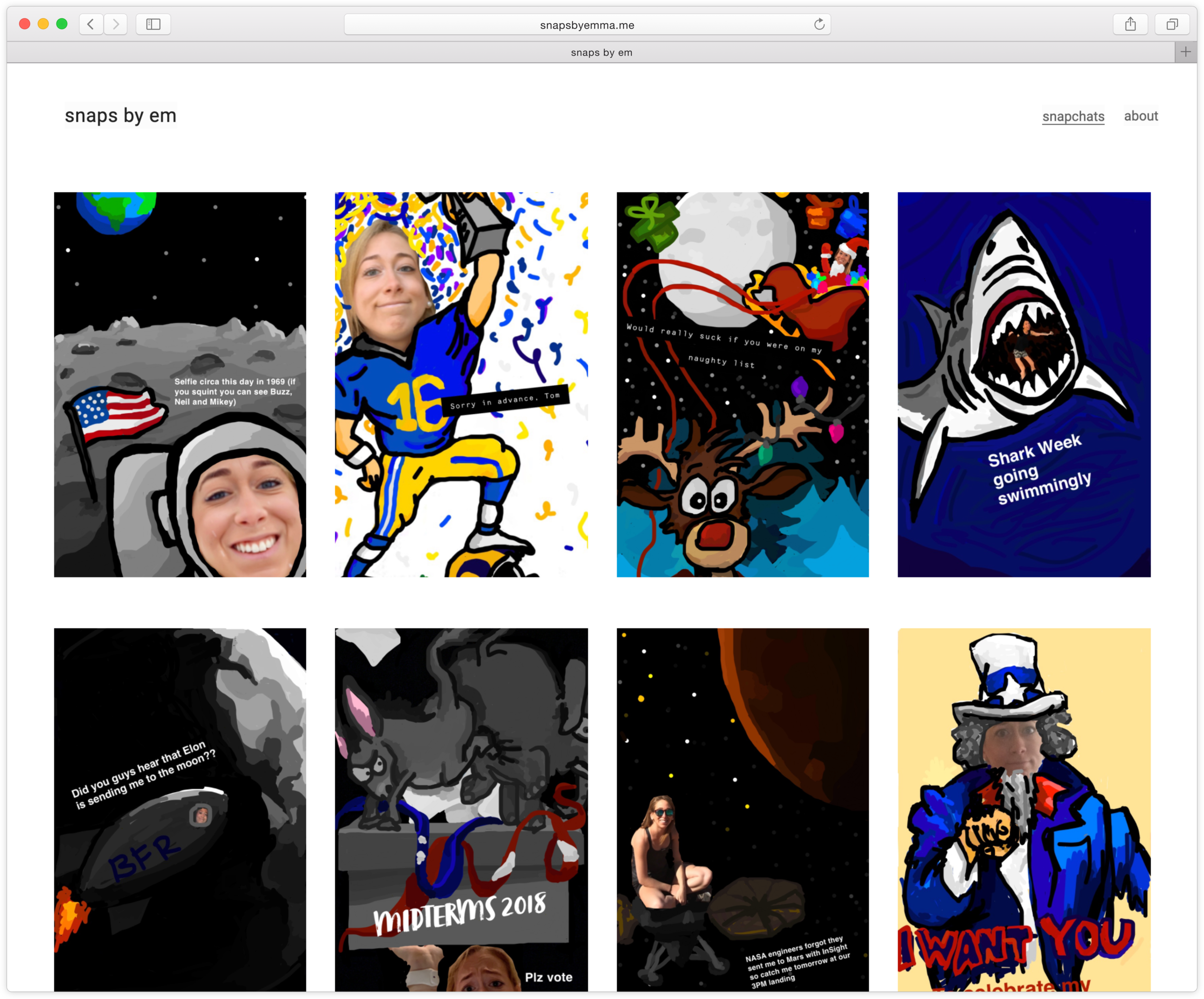
I started drawing on my Snapchats in 2013. We’re talking meaningful, quirky, one-of-a-kind drawings that typically relate to TV shows, sports, or current events. As I started sending them to friends, I got a lot of positive responses. I’ve continued creating them to this day. I do them all on my phone with just my pointer finger. And, yes, they take me an embarrassing amount of time 😀
The problem: I wasn’t getting the HTML & CSS hands-on experience I was hoping to get in my day-to-day responsibilities, and I wanted a way to showcase the Snapchats I had created thus far.
My role: Designer + developer
My team: Me, myself, and I
Deliverables: Initial mockups, usability testing, final site creation
Project completed: 2019
Ideate & design
Sketches & wireframes
I set out to create a design that at the bare minimum did the following:
Showed a gallery of all snapchats
Ability to make each image larger
An about page for people who wanted to know what the site was about
Test & iterate
Prototyping & user testing
I tested different concepts with about five different people.
Feedback included:
The first layout was too overwhelming. Changed to a grid layout to make it easier to digest.
No way of seeing all of the images at once when you click to enlarge them. Added a lightbox gallery so people could continue viewing images at a larger scale without without having to close out each time.
Not enough information about me and why I created the site. Added more information, and kept contact information on both pages.

This was too overwhelming and people didn’t know where to look. It also wasn’t clear that you could click “Snap Em” to get back to the Snapchats. In the next version, I added in navigation for that.

Experimented with putting the ‘about’ on the same page. People thought it took away from the Snapchats.

This version didn’t have large enough images. It was too hard to view each, especially when on a phone
Final design & development
I launched the MVP version of the site, though have some things in the backlog I’d like to focus on next. They include:
Improving upon the interaction design. It’s one thing to be able to design it; another to code it. Pushing myself to get better at the latter.
Optimizing images and tweaking the lightbox gallery
Including captions for each image
This was my first go at coding something on my own. I definitely learned a lot and have a long way to go. I certainly developed even more empathy than I already had for the developers I work with on a daily basis.
If you take a look at the site and have some feedback, please send my way!

